THE PROCESS OF MARC LAPIERRE
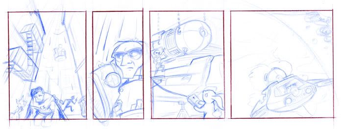
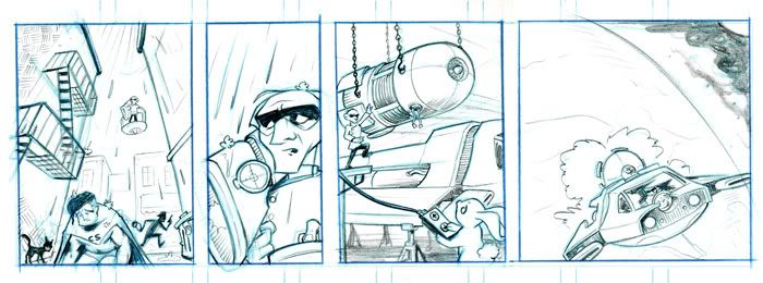
If you’re like me, you’re a sucker for these. This is your first look at the incredible amount of heart and soul SF artist Marc Lapierre pours into each and every strip. From design to the finishing details, Marc gives it everything he’s got.
But first, let’s look at what I gave him:
312 –
1: Flashback time. Flashbacks are always in black and white
with gray tones. My way of doing that has evolved over time, to the point where
the only black line in them is the panel borders. For example: http://www.th3rdworld.com/web-comic/The-SuperFogeys/episode/261-Feeling-Refreshed
We see Captain Spectacular on his knees and hunched over in
a dirty New York alleyway. Running away from him is a mugger. It’s raining and
a mangy cat on a trashcan is yelling at him. Above the Captain, in the sky,
floats Dr. Rocket on some sort of sci-fi floating platform. He holds a giant
gun in his hand that is pointed right at Captain Spectacular.
It’s the early 80’s, so Cap’s hair should be a bit bushy
with high graying sides. (http://www.th3rdworld.com/web-comic/The-SuperFogeys/episode/SF-Origins-The-Six-Wives-of-Captain-Spectacular-Pg-7-Two-Years)
Dr. Rocket is going bald on top, but he still has hair on the sides and back. (http://www.th3rdworld.com/web-comic/The-SuperFogeys/episode/SuperFogeys-Origins-Hermans-Story-Pg2-The-Happiest-Year
– notice that Dr. Rocket does not have black gloves. He first put on the gloves
as recently as the end of Chapter 6)
CAPTIONS
It was the early
1980’s, soon
after his divorce
from Michelle Masters.
The Captain
was vulnerable
and I had my shot.
2: Close up on Dr. Rocket from the previous panel as he
holds up the gun. The look on his face has changed though. It’s one of anguish and
empathy.
CAPTION
I didn’t take it.
3: Dr. Rocket and Harvey construct a spaceship together. I
have no ideas for the design. Dr. Rocket’s aesthetic tends to change with the
times. Retro sci-fi for the 50’s, Apple sleekness for the 00’s (as in the robot
you just designed). This is the early 80’s, so maybe a junky sort of Star Wars
aesthetic would be cool.
CAPTIONS
I didn’t see
an enemy that day. I
saw
my friend, hurting.
I had an epiphany.
Wretched as he was,
the Captain was not
the
cause of my suffering.
4: The spaceship rocketing away from Earth.
CAPTION
It was the Jorbons.
(Note: I’m comfortable shuffling some of the captions from
panel 3 to panel 2 if you need the room.)
Okay, so that’s what Marc got. It’s a tall order for a strip. Ambitious. The first thing Marc had to do was figure out what the spaceship looked like. When I was drawing the strip, I would just design stuff like that on the fly, within the panels themselves. That’s why my ship designs look so horrible and there are so few of them. Marc’s a better artist than that and this is what he came up with:

This was the first and only design Marc did. He just nailed it. That done, the real work of drawing the strip began. Marc draws in four steps and with every step he sends me an email for approval. He’s a dream to work with in that way. Here’s all the steps, sans my inane commentary:
ROUGHS
 If you can’t see the above image, click here!
PENCILS

If you can’t see the above image, click here!
INKS
 If you can’t see the above image, click here!
FINAL (WITHOUT LETTERING)

If you can’t see the above image, click here!
Thanks for sharing, Marc!
See you on Wednesday with SuperFogeys 313!


Typo in the last panel. “…was THE not the cause…” Thought y’all like to know before this hits any printers (always hoping the entirety of SF does) 🙂